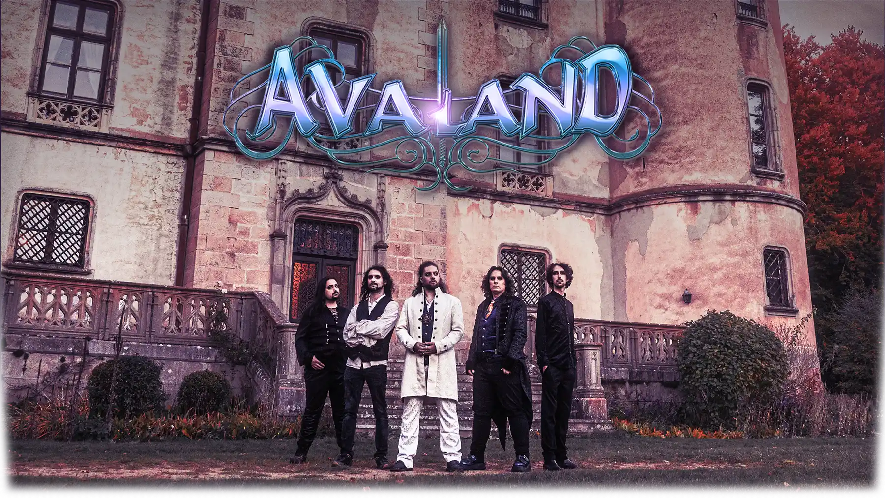
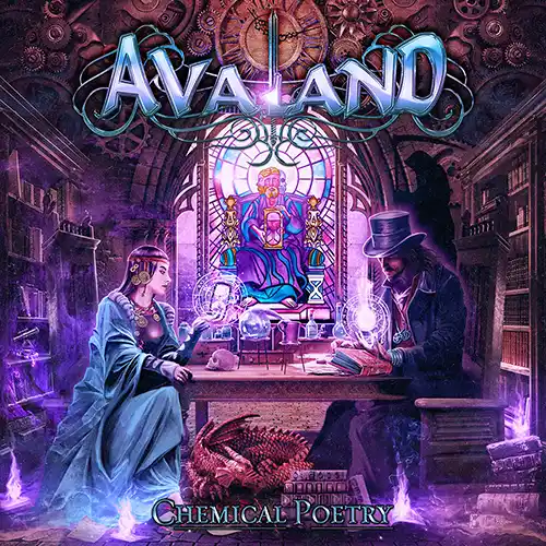
An immersive theatrical concert, only made possible by the gathering of forces :the band, the guests and the fans.
Starring :
Tom Englund (Evergrey)
Helle Bohdanova (IGNEA)
Marcela Bovio (Stream Of Passion)
Madie (Faith In Agony)
Produced by Joost van den Broek(Ayreon, Powerwolf, Epica…)
Lyon (FR)
Festival Yggdrasil, Hippodrome de Parilly
Grenoble (FR)
L'Ampérage